MyLab — booking flow redesign

Category:
Responsive Web
Client:
Internal Project
Duration:
3 weeks
Overview
MyLab is a digital diagnostic booking platform that enables users to discover lab tests, schedule home sample collection, and download medical reports online.
The product operated in a highly competitive healthcare marketplace where trust, clarity, and post-booking transparency are critical to retention.
The redesign focused on restructuring the booking lifecycle, improving checkout clarity, and creating a system-driven account experience that reduces user anxiety in a healthcare-sensitive environment.
My Role & Ownership
I worked as the Lead Product Designer, owning the redesign end-to-end.
My responsibilities included:
• UX audit of the existing product
• Booking lifecycle restructuring
• Information architecture redesign
• Checkout optimization
• Status system modeling
• Component and state system design
• Responsive web interface design
• Reduce post-payment anxiety
• Structure account architecture logically
• Developer-ready handoff and interaction logic documentation
Structural Gaps in the Existing Product
The earlier version suffered from:
• Fragmented status visibility
• Mixed dashboard hierarchy
• Poor system feedback after payment
• High cognitive load in account management
• No defined lifecycle model for bookings
UX Audit & Strategic Insight
Since no analytics were available, I conducted:
Heuristic evaluation of booking flow
Competitive analysis (1mg, PharmEasy)
Cognitive load assessment across checkout
Flow breakdown mapping of post-booking lifecycle
UX Strategy
The redesign was anchored around one central principle:
Healthcare platforms must reduce uncertainty at every stage.
This led to three strategic pillars:
• Define a visible booking lifecycle
• Reduce friction in checkout
• Structure account experience around user tasks
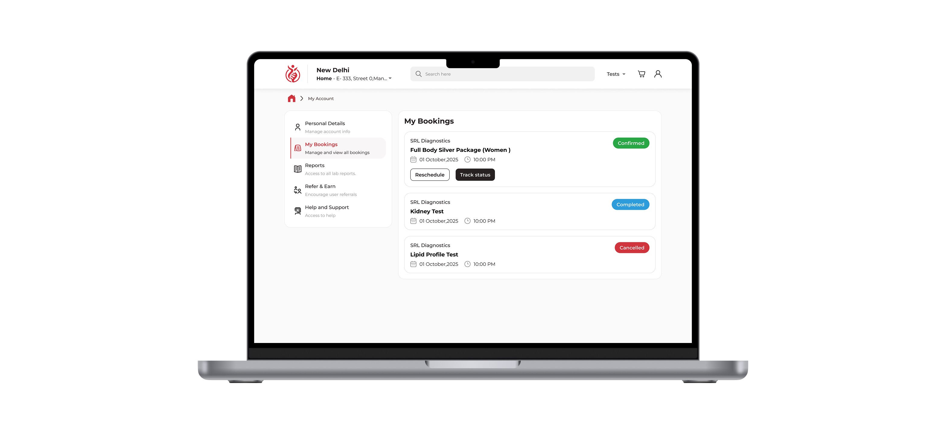
Booking Lifecycle Model
A structured lifecycle system was introduced:
Pending → Confirmed → Assigned → Sample Collected → Processing → Report Ready → Completed
Each state included:
Clear label
Visual status badge
Next-step clarity
Contextual messaging
This reduced ambiguity and improved predictability.The system was designed to scale with additional states like cancellations or delays.
Checkout Optimization
The checkout flow was reorganized into structured sections:
• Patient Details
• Address & Slot Selection
• Order Summary
• Payment
Unnecessary fields were deferred.
CTAs were simplified.
Visual grouping reduced cognitive overload.
Post-Payment Confirmation System
The earlier system provided weak reassurance after payment.
The redesigned confirmation screen included:
Booking ID
Test details
Scheduled time
Status overview
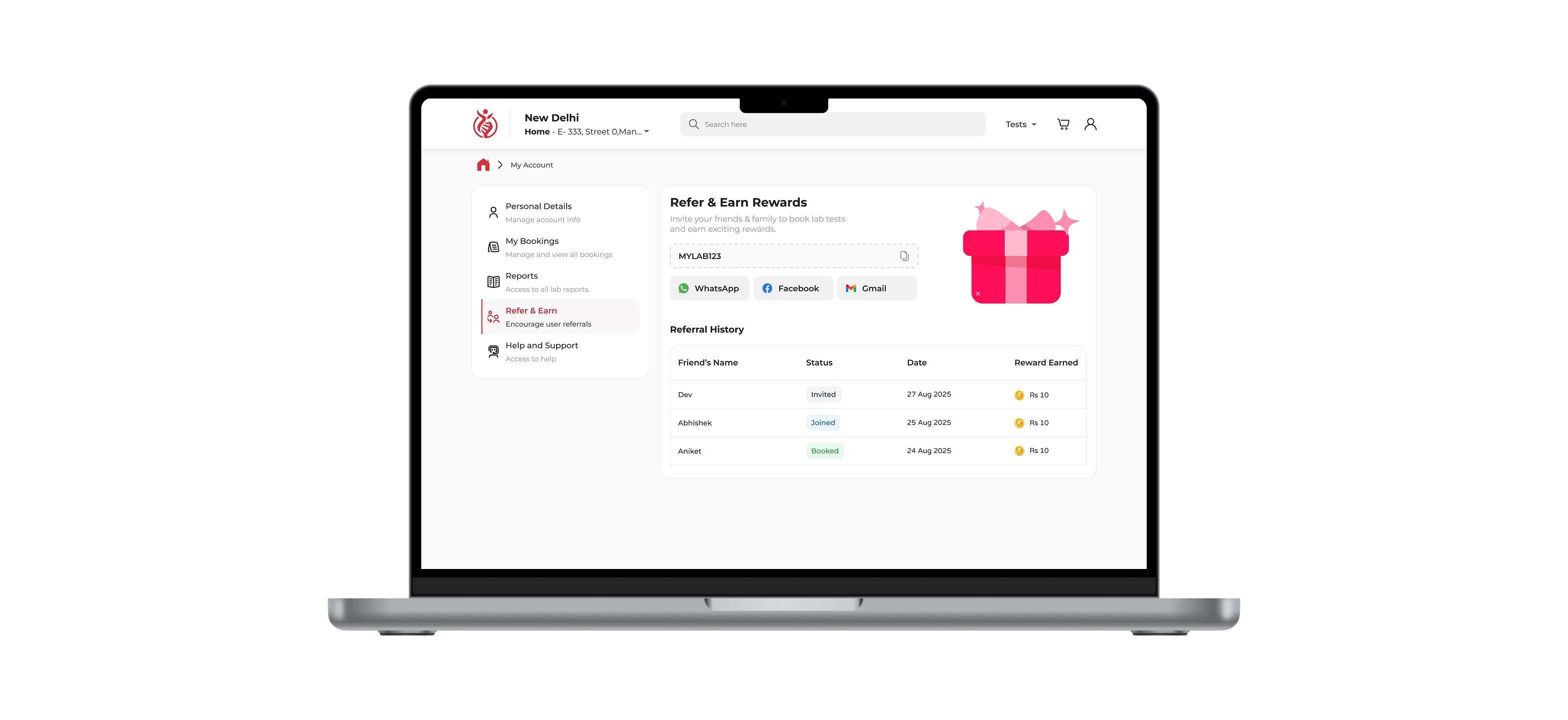
Account Architecture Redesign
Instead of a cluttered dashboard, the account system was reorganized into task-driven modules:
• My Bookings
• Reports
• Refer & Earn
• Help & Support
This matched user mental models:
“My tests”
“My reports”
“My rewards”
Navigation clarity reduced search effort and repeat friction.
Status Visibility & Operational Transparency
Structured state badges were introduced across the lifecycle.
States included:
Confirmed
Rescheduled
Completed
Cancelled
This reduced support dependency and improved perceived reliability.
Edge Case Handling
Healthcare flows demand exception readiness.
Flows were designed for:
Payment success but booking failure
Phlebo reassignment
Delayed reports
Rescheduling
Design System Foundation
To support scalability, a reusable UI foundation was established:
Status badge system
State-based color logic
Form hierarchy patterns
CTA prioritization rules
Modular card components
The system ensures consistency as new test types, geographies, or features are introduced.
Competitive Positioning
Unlike competitors that prioritize promotional discovery and marketplace expansion, this redesign emphasized lifecycle transparency and post-booking trust.
The differentiation lies in:
Structured status visibility
Clear system feedback loops
Action-driven account segmentation
Reduced anxiety during high-sensitivity healthcare interactions
Impact Hypothesis
While real analytics were unavailable, the redesign targeted measurable outcomes:
Reduced checkout drop-offs
Lower support tickets related to booking status
Improved repeat booking likelihood
Increased referral usage
Stronger user trust perception
The long-term objective was increasing user lifetime value through predictable and transparent experience design.

